Gaco – A Typeface Family with Impact, Depth, and Character
Gaco, designed by Mehmet Abacı, is a modern geometric sans-serif font family that merges clean design with bold personality. Rooted in simplicity and balance, Gaco offers powerful variations that make it more than just a minimalist typeface—it becomes a full visual toolkit.
- Gaco Strong: A bold, ultra-heavy version built to make statements. Perfect for impactful headlines, posters, and branding that demands attention.
- Gaco 3D: A dimensional, shadowed style that adds depth and a playful yet professional twist to your typography. Ideal for titles, logos, or eye-catching display work.
- Gaco Stone: Cracked and textured with a rugged stone effect, this style brings a raw, distressed look that’s great for themes of strength, durability, or vintage flair.
Why Choose Gaco?
- Versatile Styles – From sleek minimalism to textured display.
- Geometric Precision – Built on clean lines and symmetry.
- Multi-purpose Use – Ideal for branding, packaging, posters, web design, and more.
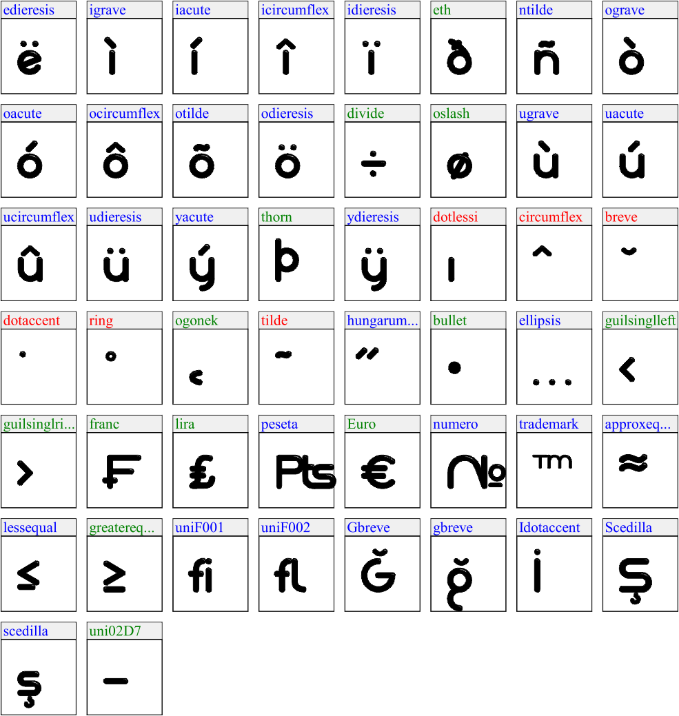
- Multilingual Support – Includes Latin Extended, Turkish, and European diacritics.

")
")
")
")


")
")
")
")
")
")
")
")
")
")
")

")